My Chosen Word: Globalisation
Final Project – 5 images:


My chosen images show how the world is connected by the sense of cultural identity and how ideas and ideologies can spread worldwide. I initially set out to take photographs of different worldwide brands to show the connection of the world through consumerism but whilst taking these initial photos I found myself connecting the globalisation theme to a lot more than I had expected. My final five images all show globalisation in a different way, I feel that this helps the audience to understand the different meanings and also showcases a wide range of photographic skills.
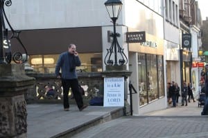
Image 1 – Preacher:
I happened to see this man preaching his ideas in the street as I was out looking for inspiration for this piece, I felt that is sign displaying religious messages conveyed the idea of worldwide ideologies well. I used a Canon 700d with an 18-55mm lens to take this image. My camera was already set up to take images in this kind of lighting but I did change the aperture slightly to get him in focus. I could of taken a lot more time on this image, the composition is poor and I could have easily created better framing if I had taken my time and taken photos from multiple angles.
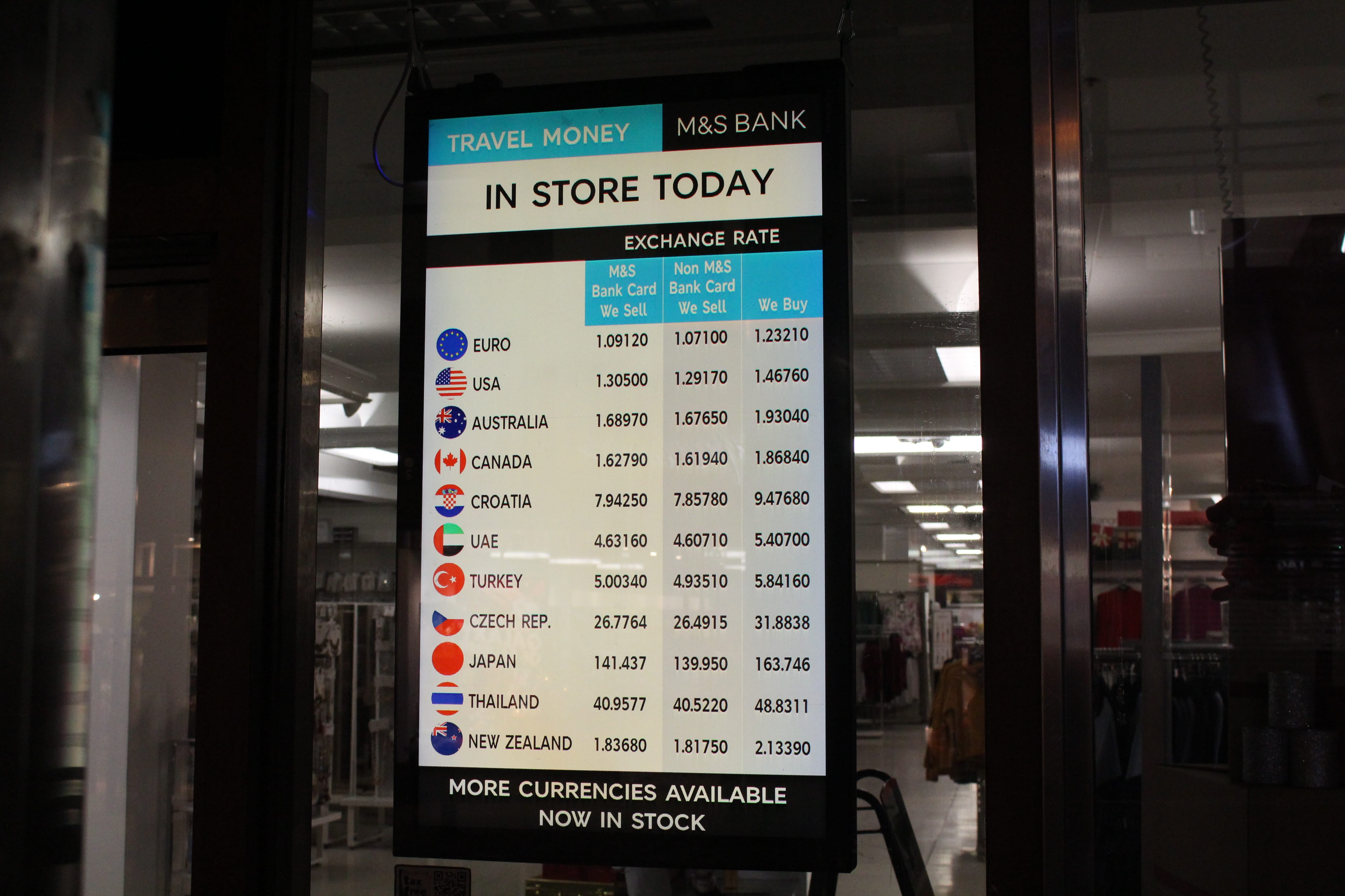
Image 2 – Currency:
The world is connected by money so I wanted to find an image I could take that related to the globalisation of wealth. This “Travel Money” board in a shop window expresses this in many ways, we see the images of different flags and the exchange rates of the different currencies. This shows how the world is connected by money but also how each country has individuality in the way they run. Although I like the concept of this image I feel that I could of made it a lot more symmetrical as the board is shown at an angle, I could of accomplished this by standing directly in front of the board instead of to one side, this would of also helped the board be more centre frame and give the image an overall better composition.
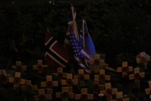
Image 3 – Remembrance:
This image represents a negative way that the world is connected; War. The flags in the middle of the remembrance poppies are a reminder of how people around the globe are effected by violence, this is negative globalisation. This image is very dark and the exposure is definitely not right, this was the first time I had attempted photography during the night so I was a little stumped as to how to create a clear image. I tried multiple different settings with the ISO, white balance, aperture and shutter speed but the image was still dark. The flash on the camera wasn’t operating properly but I feel the image still has a powerful message even though it may be dark.
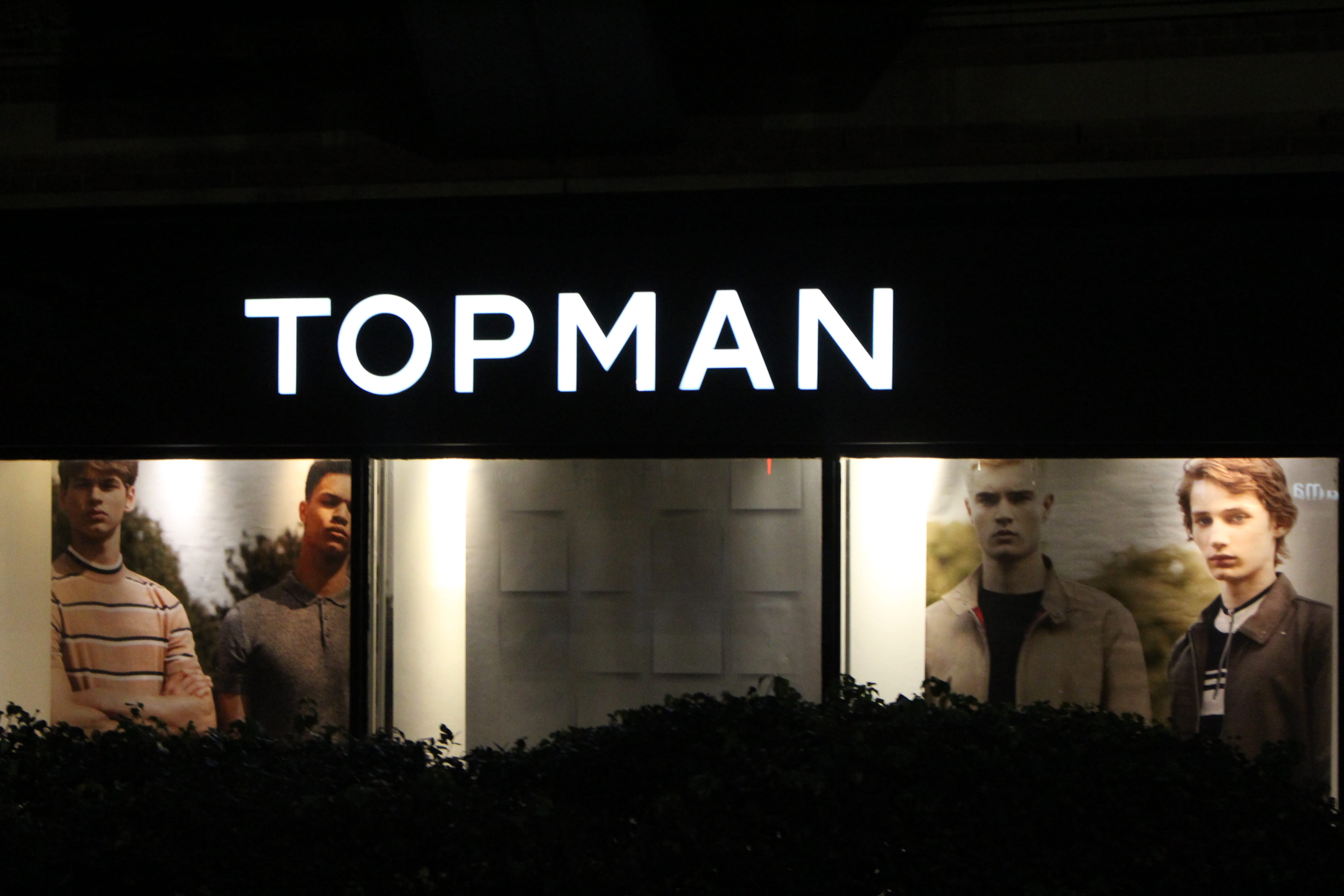
Image 4 – British:
Every country has its own identity and is proud to represent it. This image shows that even on something as unimportant as an egg carton a strong sense of patriotism is put forward by the “”British Lion”. The lion is recognised globally as a symbol for Britain/England whether it be through football badges or the royal arms. I feel that this is the best image I took for this project, the logo is centre frame and in focus. I changed the aperture so the image had a low depth of field so the carton is blurred in the background. I also feel that the lighting is nice in the image, its not dark but also not over exposed.
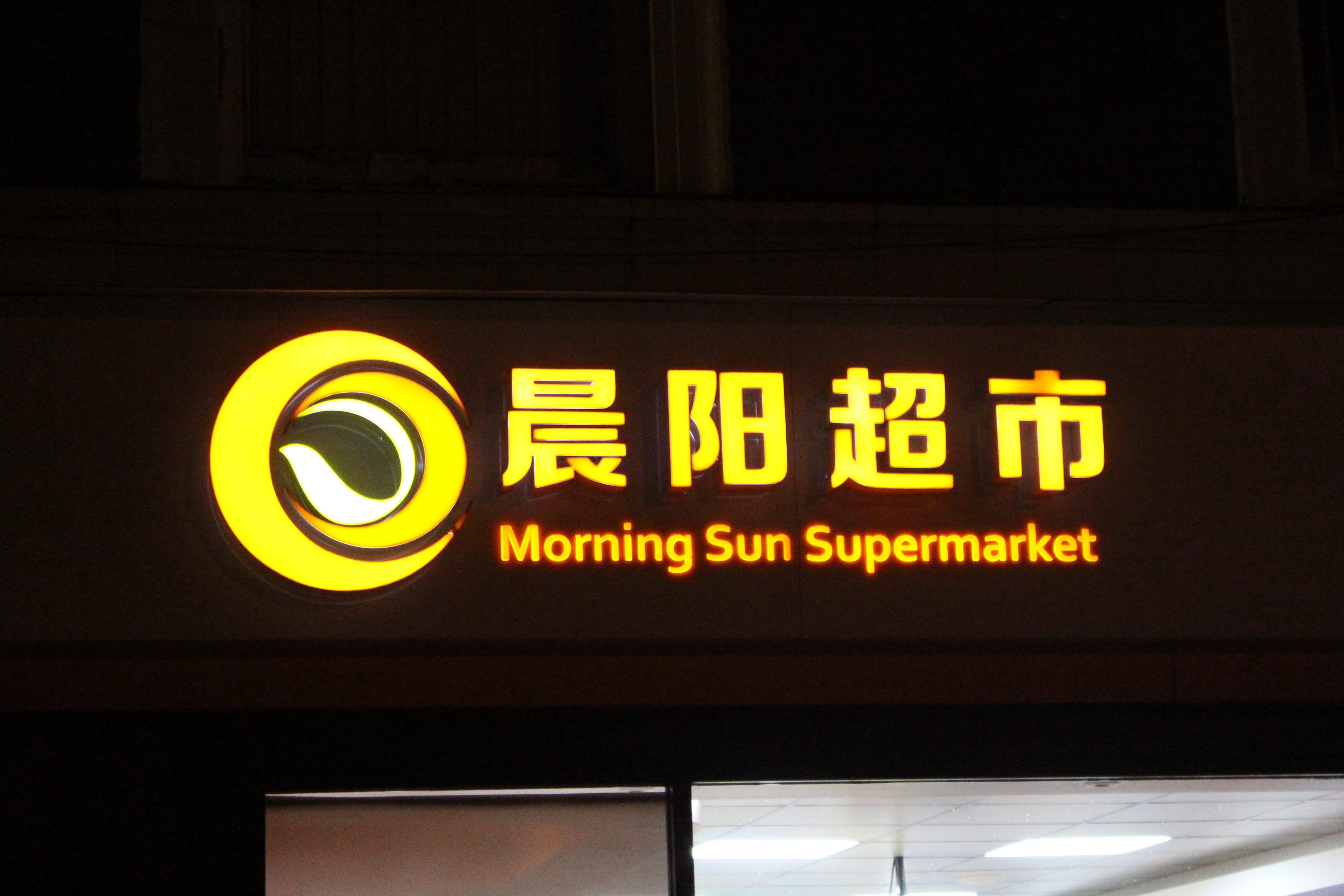
Image 5 – Sun:
This final image focuses on language and its use worldwide. This shopfront represents how language is spread worldwide and is a tool of communication around the globe. I decreased the shutter speed when taking this image to give the nice glowing effect from the neon shop sign. The composition of the image could be better because although the shop sign is in centre frame it appears slightly tilted. I could have fixed this by moving around the shop more and taking pictures from multiple angles.
Overview:
I feel that my images collate and show many different types of globalisation. I am happy with how most of my images turned out but I understand what I could of done to make them better, which i commented on in the individual image descriptions. To summarise I could work on my position when taking an image, I need to understand how the angle will effect the composition and the lighting.
Research:
Brijesh Patel
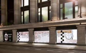


After deciding I wanted to take some photographs of the exterior of popular worldwide stores I started to research photographers who had done similar projects. I came across Brijesh Patel who has some interesting photographs, I really liked the lighting and straight lines in his images. He captured the brands and identities of the shops very well in his framing, showing them as an almost natural part of the environment, I read into this as big name brands being so globalised that they have become part of every day life and the world around us. Brijesh’s work inspired me to look at the architecture and buildings around me whilst constantly considering framing and lighting.
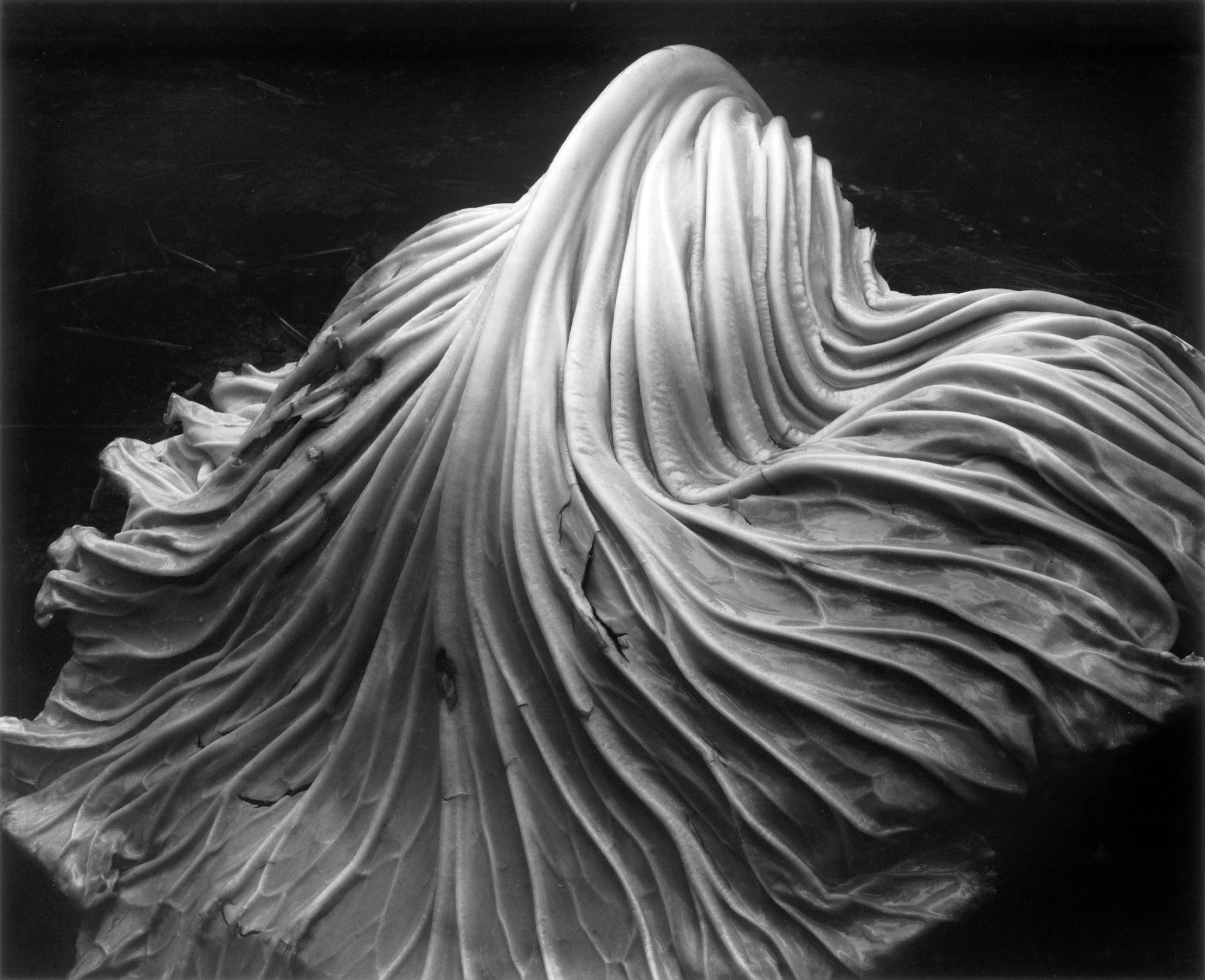
Edward Weston
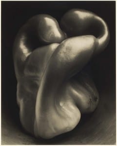

Edward Weston’s still life photography uses clever angles and key lighting in order to make objects seem alive, the most famous example of this is the pepper seen above, made to look like a boxer stretching his arms. I found his images very interesting and I was considering doing something similar for my final project however I was struggling to fit my ideas into the theme of globalisation.
Rejected Images
These are some examples of images I took for the project but I didn’t feel they were good enough to be in the final selection of photographs. I feel that most of the images didn’t properly portray globalisation in the ways I was intending and most were also of poor quality in a technical viewpoint.